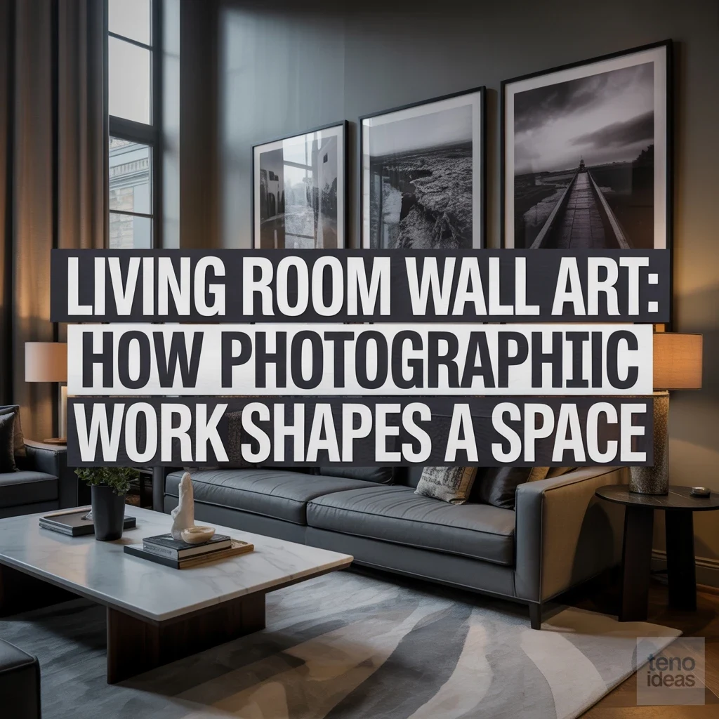
Walk into a living room anchored by a striking photograph and something subtle yet immediate happens: the walls stop feeling like solid boundaries and begin acting like apertures into another moment, climate, or perspective. Unlike oil paintings or graphic illustrations—which announce the artist's brushstroke and surface texture—photographic wall art operates through optical realism, depth of field, and emotional immediacy. Because the human eye instinctively reads a photograph as a slice of captured reality, a well-chosen print can expand a compact room's perceived horizon, cool down an overly warm palette, or introduce quiet tension above a tailored sofa.
Whether you gravitate toward silver-gelatin monochrome studies, expansive coastal horizons, or intimate macro abstractions, understanding how photographic work interacts with architecture, scale, framing, and light will help you curate a living room with lasting presence.
1. What Makes Photography Different from Other Wall Art Mediums
While a canvas painting adds physical impasto texture that sits proudly on the plane of the wall, a photograph pulls the viewer's gaze through the wall by creating true optical perspective. Through lens compression, vanishing points, and selective focus, photographic prints introduce a third dimension that can make a narrow living room feel yards deeper than its actual footprint. Furthermore, photography carries an indexical link to real light—the highlights and shadows inside the print converse directly with the natural daylight entering your windows. When styling a living room heavy on tactile upholstery like bouclé, linen, and raw timber, the smooth, luminous surface of a baryta or archival pigment print offers a crisp visual counterpoint that keeps soft furnishings from feeling overly rustic or heavy.
2. Black and White Photography and the Mood It Creates
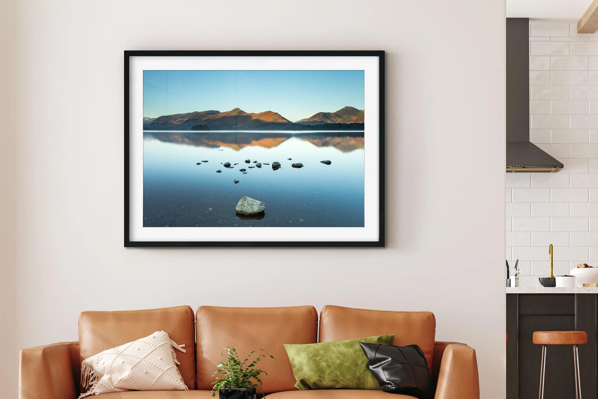
Few design tools command quiet authority quite like black and white photography. By stripping away chromatic distraction, monochrome prints distill a subject down to pure form, shadow, grain, and tonal gradation—from velvety charcoal blacks to luminous chalk whites. In a living room with a busy rug pattern, warm wood flooring, or colorful accent pillows, a large-scale black and white photograph acts as a visual palate cleanser that restores architectural calm. Pay close attention to the print's tonal temperature: warm-toned silver or sepia-inflected prints harmonize effortlessly with camel leather, walnut, and brass, whereas cool-toned platinum or high-contrast selenium prints sharpen rooms built around slate gray, chrome, and travertine.
3. Large-Scale Photographic Prints as Architectural Statements
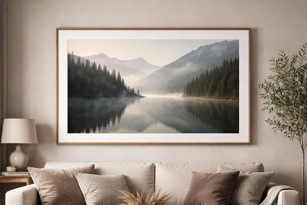
One of the most common mistakes in living room design is hanging a modest 16-by-20-inch frame stranded in the middle of an expansive drywall span. Commissioning or selecting an oversized photographic print—measuring 40-by-60 inches or spanning two-thirds the width of your primary sofa—elevates photography from mere wall ornament to a structural element of the room. At heroic scale, subtle details like ocean foam, desert dunes, or brutalist concrete geometry become immersive environments you feel almost able to step into. When hanging a single monumental print, keep the surrounding wall free of competing sconces or shelves, and position the horizontal centerline at 57 to 60 inches from the floor so the artwork anchors the seating zone at seated eye level.
4. Landscape and Nature Photography for a Calming Atmosphere
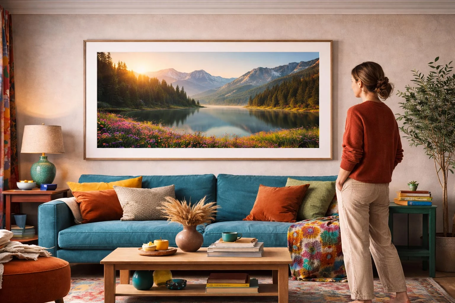
Urban apartments and inward-facing living rooms often crave a sense of open sky and natural breathing room. Landscape and botanical photography satisfies that biophilic instinct without requiring literal potted plants in every corner. The key to keeping nature photography sophisticated rather than postcard-literal is choosing compositions with generous negative space: mist-shrouded mountain ridges, low-tide shorelines with pale sky occupying two-thirds of the frame, or wind-swept grasses photographed in soft overcast light. These high-key, low-saturation horizons slow down the visual rhythm of a room, lowering stress the moment you sit down in the evening. Pair misty coastal or alpine prints with unbleached linen drapes and bleached oak tables to extend the airy serenity across the room.
5. Portrait and Figurative Photography as Conversation Starters
Introducing a human silhouette, a candid street scene, or an evocative figurative study immediately changes the psychological charge of a living room. Because human neurology is wired to notice posture, gesture, and gaze first, a figurative photograph acts as a magnetic focal point that sparks curiosity and conversation among guests. If a direct, front-facing studio portrait feels too intense for a relaxing lounge area, opt for three-quarter profile studies, dancers in motion blur, swimmers seen from above, or anonymous figures walking through architectural colonnades. Hang figurative work near reading chairs, bar consoles, or fireplace mantels where guests naturally pause at close range to appreciate the narrative nuances.
6. Abstract and Macro Photography for Texture and Intrigue
When a living room already features strong architectural lines—such as exposed ceiling beams, grid windows, or built-in cabinetry—literal representational scenery can sometimes feel visually busy. Abstract and macro photography solves this beautifully by zooming in on light patterns, weathered stone striations, rippling water reflections, or botanical petals until the subject dissolves into pure texture and tone. Viewers first experience the print from across the room as a balanced composition of shadow and color, and only upon stepping closer discover that the shapes are actual photographic captures of ice crystals, sand waves, or folded paper. This dual reading rewards daily living, giving your walls quiet mystery that never grows stale.
7. Color Photography and How It Interacts with a Room's Palette
Color photography in a living room works best when it either echoes subtle secondary tones already present in your textiles or introduces a deliberate complementary accent. Rather than matching a photograph's colors one-for-one with your throw pillows—which can quickly look staged—use the print as the room's color thesis. For instance, a sun-bleached Mediterranean architectural photograph containing warm terracotta, chalky ochre, and deep Aegean blue can effortlessly bridge a cognac leather armchair and a cool gray wool rug. Pay attention to color saturation: muted, film-grain color prints with dusty midtones blend organically into residential light, whereas hyper-saturated commercial prints work best in crisp, white-walled modernist spaces.
8. Framing and Matting Choices That Affect How Photographic Art Reads
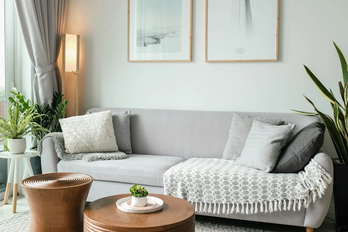
The exact same photographic print can read as a classic museum study or a sleek contemporary installation depending entirely on how it is framed and matted. An archival 3- to 4-inch cotton rag window mat inside a slender blackened-steel or natural walnut gallery frame creates a generous breathing border that honors smaller 11-by-14 or 16-by-20 prints, drawing the viewer inward. Conversely, full-bleed dry-mounting flush to the edge of a deep shadow-box frame gives oversized color or architectural photography a bold, modern immediacy. Always invest in UV-filtering, anti-reflective museum acrylic or glass—standard float glass turns dark photographic shadow areas into distracting mirrors whenever opposite living room windows are bright.
9. Gallery Walls Built Specifically Around Photographic Collections
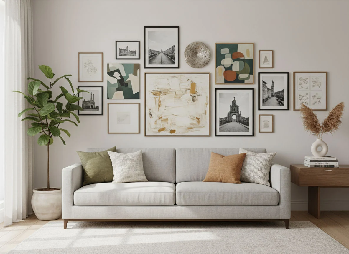
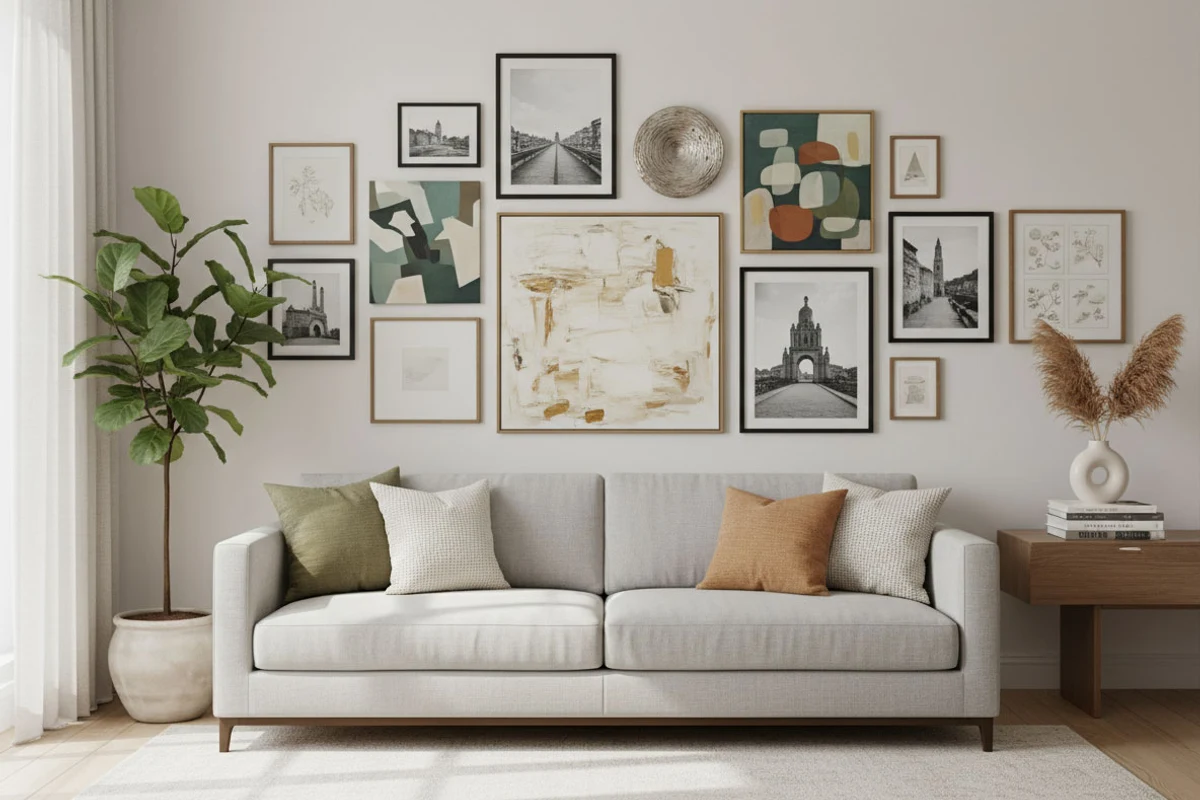
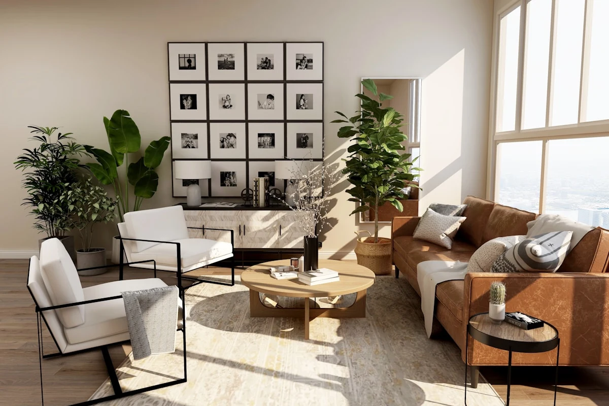
A photographic gallery wall succeeds when it is governed by a clear visual thread—either a unified grid of identical frames or an organic salon hang linked by tonal palette and paper stock. For a tailored, architectural aesthetic above a long credenza or sectional sofa, hang a two-by-three or three-by-three grid of matching black oak frames with uniform three-inch white mats, spaced exactly two inches apart. If you prefer an collected salon wall mixing vertical portraits and horizontal landscapes, anchor the composition around one central larger print and keep every frame in the same family of wood, brass, or matte black so the photographs themselves—not clashing moldings—tell the story.
10. Placement and Lighting Considerations Unique to Photographic Prints
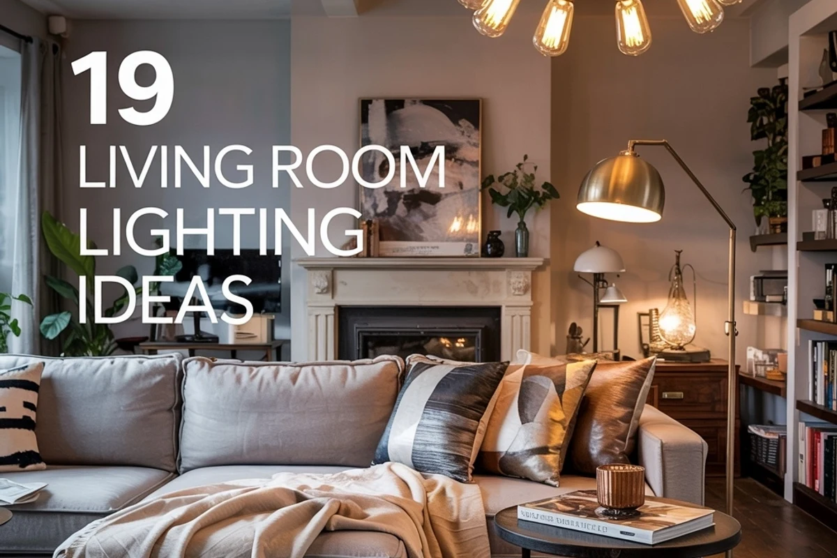
Photographic emulsions and archival pigment inks are uniquely sensitive to both direct ultraviolet sunlight and glare angles. Never hang valuable photographic work on a wall that receives hours of direct, unfiltered afternoon sun, which can yellow cotton rag paper and shift delicate cyan and magenta dyes over time. Instead, select perpendicular walls washed in indirect ambient daylight, and supplement evening viewing with ceiling-recessed adjustable gimbal spotlights angled at 30 degrees or a slim brass picture light mounted above the frame. A 2700K to 3000K high-CRI (90+) LED bulb renders skin tones, warm wood frames, and deep monochrome blacks with gallery-grade fidelity after sunset.
11. Sourcing Original or Limited-Edition Photography Versus Mass-Produced Prints
Building a meaningful living room wall does not require blue-chip auction budgets, yet moving beyond ubiquitous big-box poster reproductions transforms the soul of your home. Independent photography fairs, university darkroom sales, artist-run print collectives, and signed open- or limited-edition archival giclée releases allow you to acquire museum-grade cotton rag or silver-gelatin prints directly from working photographers at accessible price points. Look for prints printed on heavyweight 300gsm+ archival paper (such as Hahnemühle Photo Rag or Canson Platine) with signed certificates or edition numbers on the verso. Knowing the artist's hand and lens behind the print infuses your living room with genuine provenance.
12. How Photographic Art Choices Reflect Personal Story and Memory
At its highest level, the photography you hang in your living room becomes a visual autobiography of the places, textures, and atmospheres that move you. Mixing commissioned fine-art prints with your own high-resolution travel or architectural photographs—printed consistently on matte archival paper and custom-matted to the same gallery standards—turns a living room into an intimate sanctuary that belongs to no one else. A quiet frame captured on a foggy morning in Kyoto or along the Amalfi cliffs, matted generously beside a professional landscape study, bridges fine design and lived memory every single time you walk into the room.
Conclusion: Treating Photography as Architectural Design
Choosing photography wall art for your living room is far more than filling an empty drywall rectangle after the sofa arrives. Because photography manipulates light, horizon depth, tonal contrast, and emotional presence, a single thoughtfully scaled and archival-framed print can reshape how spacious, serene, or dynamic your entire room feels.
Whether you anchor your seating area with one monumental landscape, quiet a busy palette with warm silver-toned monochrome, or build a disciplined gallery grid that weaves together fine art and personal travel memories, approach every photographic frame as a deliberate architectural window. When scale, anti-reflective glazing, and warm lighting align, your walls will tell an unforgettable visual story for years to come.